Designing for whatever my agents and I build next
How I made sure my next idea would feel at home alongside the rest of my work. The trick was deciding which design choices my agents could carry forward.
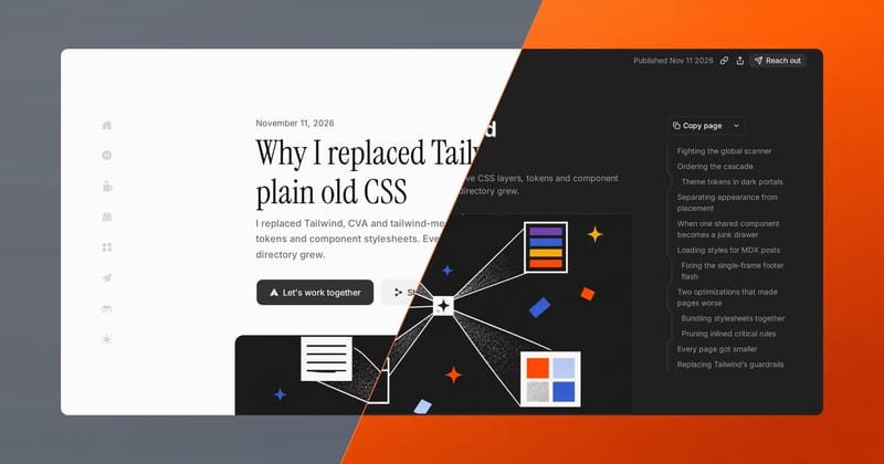
I want the tools I build with coding agents to feel related, even when they look quite different. I also want the freedom to try a weird layout if it suits the tool.
So how much do they actually need to share?
My portfolio was a good place to find out. I still like the old site. It worked well for a few static pages about me and my work. But I’m starting out as an indie hacker, and I’d like someone who finds one thing I’ve made to have an easy way to find the others.
Give the dock a job
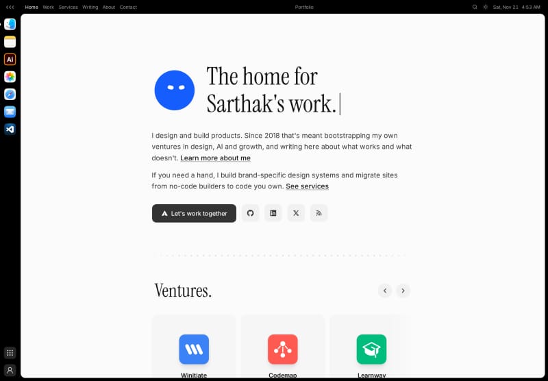
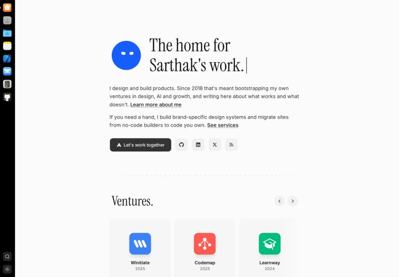
The dock gives each page or tool a place in the navigation. An icon can open a page on my portfolio or a whole other site. Search and the theme switch can live there too.
I started building it in OpenCode. With those controls in the dock, I could design each page around what you’d do on it.
Keep the useful part
For the Library, I borrowed Notion’s folder tree. My posts, work and services fit neatly into it, and you could browse them while keeping a document open.
Claude and I got it looking close enough that I started confusing the Library with the actual Notion tab I had open.
I asked Codex to try Linear’s colors on a separate branch, then eventually settled on a palette inspired by Cron Calendar.
The folders stayed through both changes. They let you open another piece of writing without going back to an index. That was the part I wanted to keep.
Match the ordinary things
For Home, I tried a FigJam board with torn paper notes. I had Claude curl the bottom edges so they’d cast a shadow. We got the paper looking right. I went with a grid of tiles instead.
The grid gave me room for a robot, recent posts and the ventures I’ve worked on. But next to the Library, it looked like a different site.
I asked Claude to keep the grid and match the Library’s type, buttons and corner radii. The pages felt related without sharing a layout. Home could keep its blinking robot.
On a phone
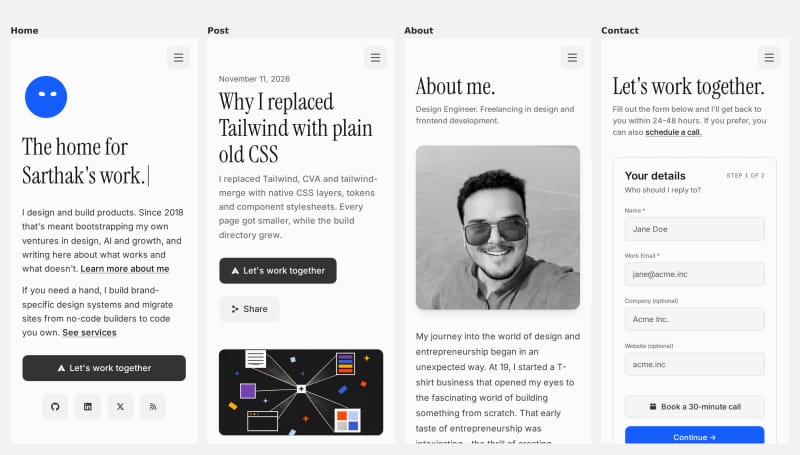
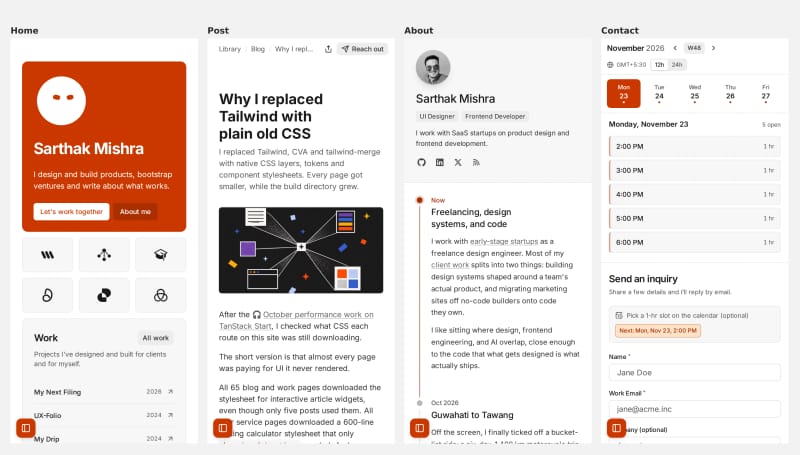
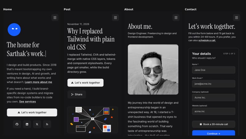
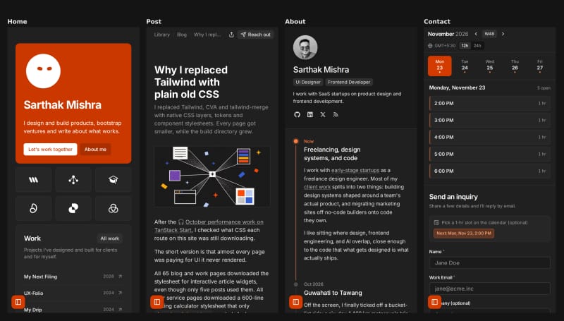
The old site was designed around a larger screen. I made it work on phones, but I was mostly squeezing that design into less space.
This time, I compared the alternatives with mobile use in mind. That shaped how the dock and sidebar open, the transitions between pages, and how Home’s tiles stack. I kept the designs that looked and felt right on both screen sizes.
Give agents a starting point
I don’t want to spend an afternoon explaining how a menu should work every time I ask an agent to try a new idea. So I adopted vercel’s new UI SDK and gave the agents a small set of shared controls, with rules for when to use them. I can ask for a different layout and still know what I’m getting when I ask for a button.
Comparing whole layouts took a little more setup. While Claude worked on the dock’s click bounce, I had Codex fix the dev servers so I could open two versions at once. I could keep a version I liked and judge an alternative in the browser.
That made it easier to throw out a layout, even one I’d just spent time getting the paper shadows right on. Working this way helped me finish the migration in about a week.
The next site
The dock is the part I want to take with me. A future tool can reuse the portfolio’s controls and colors where they fit, or have a look of its own. With a spot in the dock, someone reading one of my posts has a way to find it. With the dock on the tool too, someone who finds the tool first can discover the rest of my work.
That’s about as much cross-promotion as I want when I’m halfway through reading something. An icon at the edge of the page, and the option to hide it.