Phidata - AI Assistant Platform Landing Page
A comprehensive landing page redesign for an innovative AI assistant platform, focusing on clear communication and conversion optimization.
When Phidata (now AgnoAGI) approached Drool, they had an innovative AI Dev-kit but needed a compelling way to communicate their value proposition to potential users. The challenge was creating a landing page that could effectively showcase their complex AI capabilities while maintaining clarity and driving conversions.
The Challenge
Phidata’s approach was simple yet groundbreaking, but their existing presence didn’t reflect the sophistication of their AI assistant platform. They needed a landing page that would be visually appealing, easy to navigate, and optimized for conversions while clearly demonstrating the benefits and capabilities of their technology.
The timeline was tight, but I saw this as an opportunity to create something that would truly set them apart in the crowded AI space.
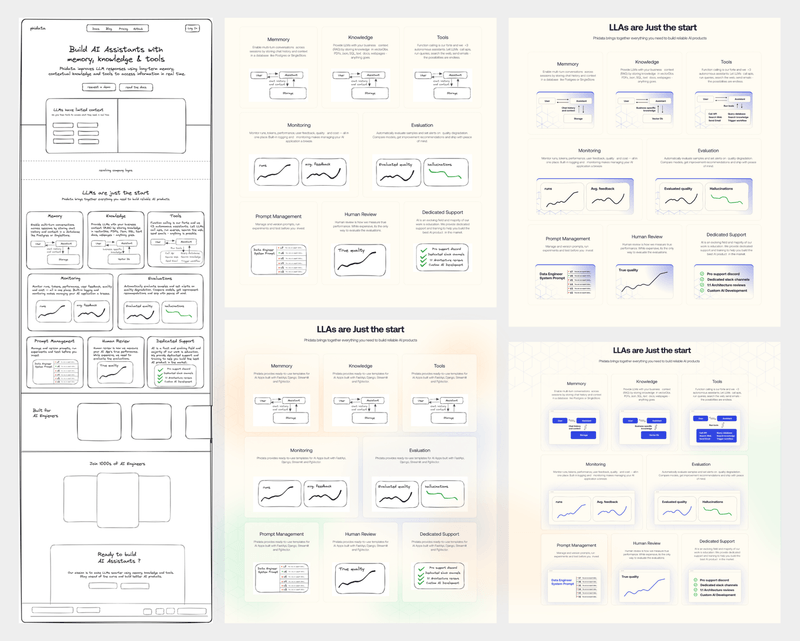
Early wireframes and strategic planning for the landing page structure
The Design Process
We began this project with comprehensive research into Phidata’s brand, target audience, and unique value proposition. Understanding their innovative edge was crucial for creating a landing page that would resonate with potential users and effectively communicate their technology’s capabilities.
Low-fidelity prototypes exploring different layout directions
Strategic Approach
Our process followed a structured methodology:
- Initial Discovery and Planning - Understanding the brand and technical requirements
- Wireframing and Low-Fidelity Prototypes - Exploring multiple layout directions
- High-Fidelity Prototype Development - Creating the first visual iteration
- Iterative Refinement - Incorporating feedback and optimizing user experience
- Webflow Development - Bringing the design to life with interactive elements
- Launch & Monitoring - Ongoing optimization based on user behavior
The key was balancing visual appeal with functional clarity - making complex AI concepts accessible without oversimplifying the technology.
Multiple design directions and visual style exploration
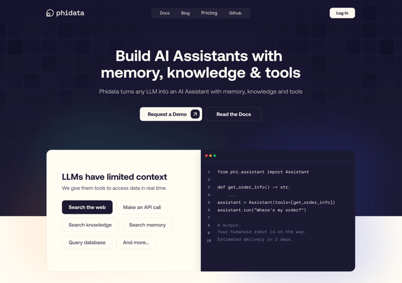
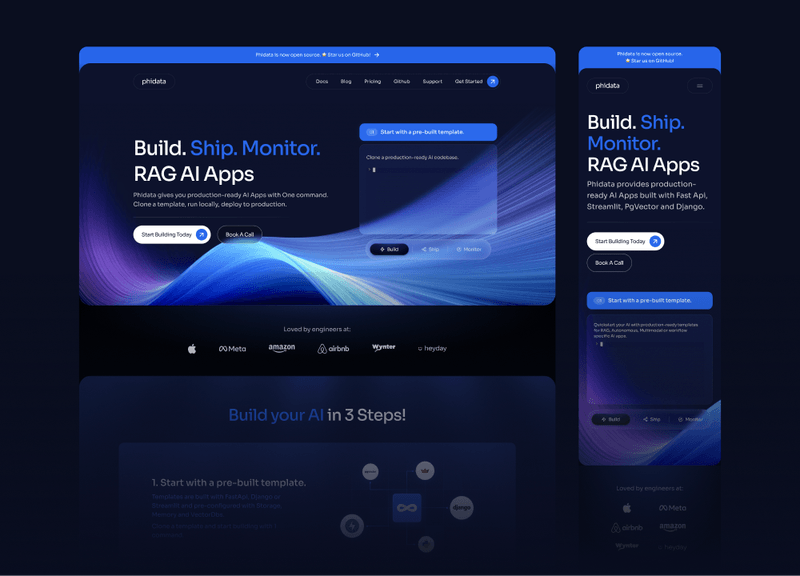
The first high-fidelity prototype incorporating brand identity and user feedback
Iterative Design Evolution
Throughout the design process, we explored multiple visual iterations to find the perfect balance. Each iteration involved experimenting with different color schemes, typography, iconography, and imagery to enhance visual appeal while aligning with Phidata’s branding.
Key Refinements
After the first iteration, we focused on several critical improvements:
- Enhanced Information Flow - Simplified navigation to make it more intuitive and user-friendly
- Content Restructuring - Reorganized sections for better accessibility and understanding
- Visual Cohesion - Refined color scheme, typography, and imagery for a more engaging experience
- Interactive Elements - Integrated Lottie animations to add dynamic aspects while maintaining design consistency
The most crucial section we designed was the Information Flow area, intended to showcase Phidata’s features and efficiency in the simplest way possible. We structured this to highlight key functionalities through clear, concise descriptions and engaging visuals.
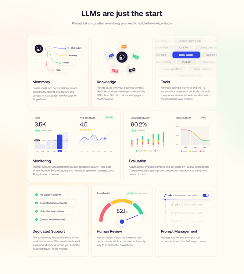
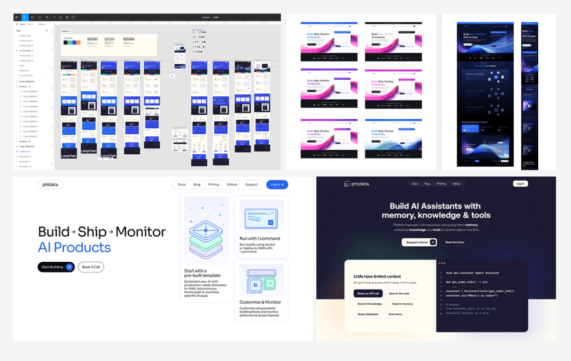
Information flow section designed to showcase features clearly
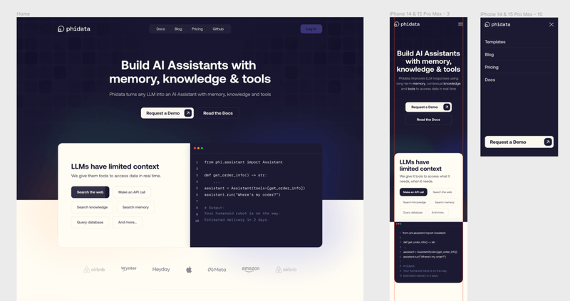
Responsive design ensuring seamless experience across all screen sizes
Block-based design for easy content management
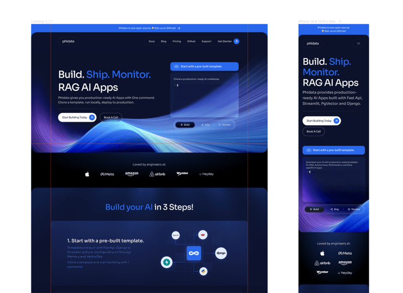
Responsive Design Excellence
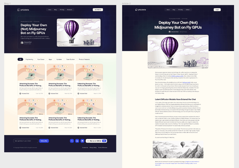
One of the most important aspects was ensuring the experience worked seamlessly across all devices. We meticulously crafted both web and mobile versions of the landing page, along with product pages and blog pages, ensuring consistency and usability throughout.
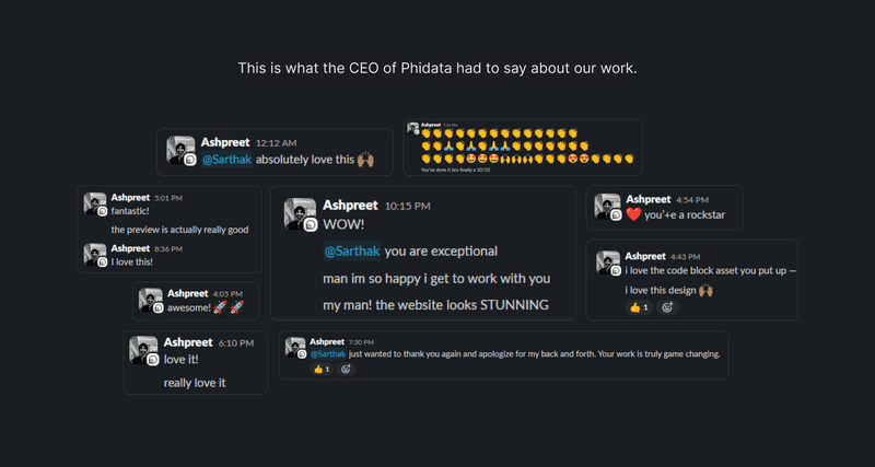
Ashpreet's (CEO of Phidata) feedback on the designs
The responsive design wasn’t just about making things fit different screen sizes - it was about optimizing the information hierarchy and user flow for each device type. Mobile users needed quick access to key information, while desktop users could engage with more detailed content and interactive elements.
Technical Innovation
Working with Phidata pushed me to explore new technologies and design approaches. Learning and implementing optimized Lottie animations for interactive elements was particularly rewarding - it allowed me to create dynamic experiences that matched the innovative nature of their AI technology.
Key Technical Achievements
- Conversion-Optimized Layout - Every element placed strategically to guide users toward action
- Performance Optimization - Fast loading times despite rich visual content
- Accessibility Standards - Ensuring the design was inclusive and accessible to all users
- SEO Optimization - Structure and content optimized for search engine visibility
Results & Impact
The final landing page significantly contributed to Phidata’s rapid user growth and reduced the learning time required for users to understand their product. The clear information flow and engaging visuals helped potential users quickly grasp the benefits and capabilities of their AI assistant technology.
By working through multiple iterations and maintaining close collaboration with Phidata’s team, we delivered a landing page that not only met but exceeded their expectations. The project demonstrated how thoughtful design can transform complex technology into an accessible and compelling user experience.
“This project taught us that the best way to present complex technology is through clear, purposeful design that respects the user’s time and intelligence.”
Working with Phidata was a reminder that innovation in AI requires equally innovative design thinking - sometimes the most advanced technology needs the most human-centered approach to communication.