SaaS landing page design and build
One landing page for your SaaS, planned, designed and built. A clear structure for your offer, a responsive design in your brand and a page you own.

Most SaaS products are better than their landing page. The product works and customers like it, but the page lists features instead of saying who it’s for, buries the main action under three others, or still looks like the template it started from.
I plan, design and build a landing page that explains your product and gives visitors a clear next step.
Every section earns its place
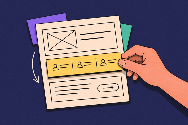
I review your product, audience and offer, then plan the sections and their order in a wireframe you approve before any visual design starts.
A page that looks like you
The page uses your logo, colors and type, with layouts designed for desktop and mobile rather than squeezed from one into the other.

Built to be responsive
I build your page in Next.js, TanStack Start or Astro, including the interactions in the approved design. You own the codebase.

Make the next step obvious
Each page leads to one primary action, such as a demo request, sign-up or waitlist, connected to the form or scheduling tool you already use.

Ready for search and AI
I make your page readable by search engines and AI tools, with metadata, structured data and useful image descriptions.

Accessible to all, without fail
Before launch, I test mobile layouts, keyboard use, contrast, links, form submissions, page load and analytics events.
Yours, with 14 days of fixes
You own the Figma file, code and accounts. I fix bugs in the work I delivered for 14 days after launch.

This isn’t a Migration, which keeps your current site looking and working the same on a new foundation. A landing page project rethinks how the product and offer are presented. We start with a free review to work out what your page needs.
Why the page needs a plan.
Early landing pages tend to grow one request at a time. A waitlist form goes in for launch, a feature grid after the first big release, logos once customers sign. A year later the page describes every feature and still doesn’t tell a first-time visitor what the product is or what to do next.
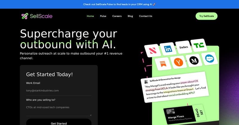
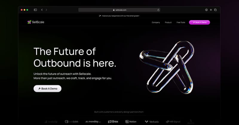
The earlier SellScale hero asked visitors to fill in a two-field form before it had shown what the product does, next to a collage of press logos, a sample email and a booked-demo card. The page we designed at Drool led with one line about outbound, explained it in two more, gave it one action and used the 3D work to make it memorable rather than to explain it.
That’s why the first deliverable is a section plan, not a mockup. We agree who the page is for, what they need to believe before they act, and which proof supports each claim. A developer tool might lead with code, while a sales tool might lead with outcomes and customer proof. Visual design is much faster once those questions are settled, and much less likely to be reworked.
I design and build the page. On mobile, I keep the important parts first instead of just stacking desktop columns in whatever order they were coded.
Where are we starting?
A new launch, a redesign and a page that only needs building are different amounts of work. Pick where you’re starting and where the page should live to see what’s involved.
Design work happens in Figma. The build is a Next.js, TanStack Start or Astro codebase, delivered in your repository as a new site or a pull request to your existing project. I use TypeScript and Tailwind CSS by default and follow your existing styles when adding to a site. Paid ads, ongoing conversion testing, a full brand identity, product UI redesign and additional pages stay outside the base scope, or are quoted separately if you need them.
Landing pages I’ve designed and built.
Before building my own product, I ran Drool, a design studio for early-stage startups. For Phidata, now Agno, we planned, designed and built the landing page for an open-source framework developers use to build AI assistants.
Phidata’s earlier site still described a data engineering toolkit, with a centered headline, two lines of copy and one button. Its audience reads code before marketing copy, so the hero we designed named what developers build with it, put a ready-to-clone template in a terminal panel and kept the same story on mobile.
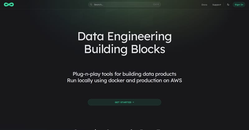
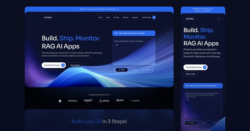
Every section was designed for mobile as well as desktop. On a phone, the code example sits below the tool choices instead of beside them, and the menu keeps the demo request as its main action.
For SellScale, we designed the landing page alongside more than 200 product screens, including the Spline 3D hero and a custom icon set, so the marketing site and the product looked like they came from the same company.
Today I build in React and TypeScript. This site and WeKeep, the accounting platform I’m building now, are both mine end to end, from the layout to the deployment.
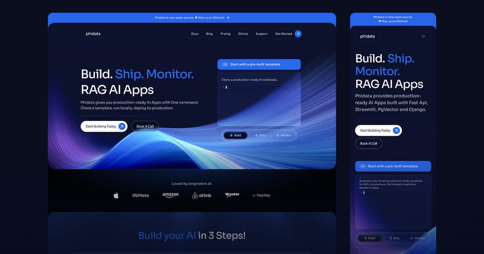
Phidata - AI Assistant Platform Landing Page
A comprehensive landing page redesign for an innovative AI assistant platform, focusing on clear communication and conversion optimization.
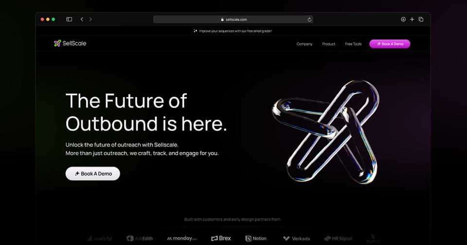
SellScale - AI-Powered Cold Outreach Platform
A comprehensive design overhaul of an all-in-one cold outreach platform that automates LinkedIn and email campaigns for B2B sales teams.
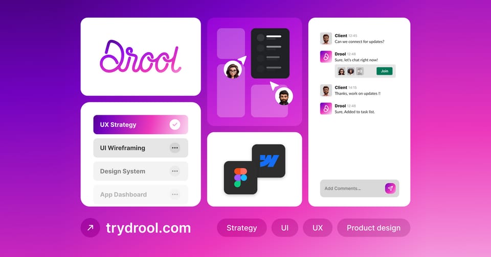
Drool
Drool was a design agency for early-stage startups in AI, B2B, data analytics, and no-code SaaS, built on cold outreach and later sunset.
SEO and AEO, built into the page.
I build the page so its main text and links are available before JavaScript runs. Search engines and AI tools can retrieve the product explanation, pricing and FAQs directly. That’s the starting point for both SEO and AEO, or answer engine optimization. This site is where I’ve built and tested that work.
Metadata that matches the page. Each page here has its own title, description, preferred URL and social preview. Structured data identifies articles, services, their author or provider, and the questions answered on the page. The FAQ markup comes from the same answers visitors read, so editing an answer updates both.
A readable copy for AI tools. The public content pages also have a Markdown copy, including this page’s text version. It keeps the headings, links, tables, code and image descriptions while removing navigation and form controls. The llms.txt index points to those copies, and the full-text export collects them for tools that need several pages at once. They’re generated from the published pages, so I don’t have a second version to maintain.
Feeds that update with the content. The build generates RSS, Atom and JSON Feed versions of my post and project summaries, with links back to the full pages. Feed readers and other tools can follow new work without scraping the layout. The sitemap lists the public pages, while the crawl rules tell bots which areas they can access.
Image descriptions with a review step. I use AI to generate descriptions for new or changed images during content preparation, then review them. Alt text I’ve written for a particular image takes priority over the generated fallback. That gives screen-reader users and crawlers a text description of the image, with none of the AI work running in the visitor’s browser.
Internal links with a reason to click. This site also generates related-reading suggestions and internal links between relevant passages and posts, case studies or services. A reader can follow a claim to the project or explanation behind it, and crawlers have links to follow through the site.
Your landing-page build includes readable HTML, metadata, appropriate structured data, image alt text and crawlability checks. For a site with articles or documentation, I can add the Markdown exports, feeds and image-description workflow to the scope.
Performance is part of the build.
My home page scored 100 in Performance, Accessibility, Best Practices and SEO in its October 30 mobile PageSpeed Insights run, with its largest contentful element painted in 0.9 seconds. That’s one lab measurement of this site’s home page under the report’s test conditions.
The work behind that result included cutting unnecessary JavaScript, loading dialogs when someone uses them, and keeping heavy embeds out of the initial load. Images arrive as responsive AVIF or WebP files, fonts load only the character sets needed, and the page’s text can paint before the app starts. Size checks in the build catch growing bundles before they ship.
I take the same approach to your landing page. The hero and main text load first, images further down can wait, and forms stay usable while the rest loads. I check loading speed and layout shifts on mobile and share the Lighthouse report before launch.
Priced by page, quoted after a review.
A page built from your approved Figma file and a launch page written from customer interviews aren’t the same job, so I quote a fixed price after reviewing your product and current page. Every quote names the sections, breakpoints, integrations and platform included. These examples show where most projects land.
Page design
One landing page planned and designed in Figma, ready for your team to build.
From $750
About 1 week
- Review of your product, audience, offer and current page
- Section plan and wireframe for one page
- Desktop and mobile designs in your brand
- Edits to the copy you supply
- Structured Figma handoff with states and spacing marked
Design and build
One landing page designed and launched as a Next.js, TanStack Start or Astro codebase.
From $1,500
2–3 weeks
Everything in Page design, plus:
- Responsive build of the approved design
- One primary form, sign-up or scheduling integration
- Page metadata, social preview, structured data and crawlability checks
- Responsive images, alt text and a mobile Lighthouse report
- Agreed analytics events
- Mobile, keyboard, contrast, link and form checks before launch
- Deployment or pull request, with 14 days of bug fixes
Launch page
A landing page with copy written from interviews and the supporting pieces for launch.
From $3,000
3–4 weeks
Everything in Design and build, plus:
- Copy written from interviews with you and your customers
- CMS editing for the sections your team changes often
- Custom motion, such as Lottie or a Spline scene
- One supporting page, such as pricing or a waitlist confirmation
You pay half of the quote to start and the rest at launch or handoff. On a $1,500 project, the deposit is $750. Once you accept the quote, the price stays fixed for the agreed scope. Prices are in USD and exclude tax and any paid tools, hosting or plans in your name.
When one page turns into more.
Starting with one page keeps the commitment small. If you want to go further later, sections and components we’ve already built carry over and aren’t charged twice.
Additional pages, such as pricing, about or a feature page, reuse the agreed design and are quoted per page.
A UI Sprint makes sense when the product your landing page sends people to needs the same care, starting with sign-up or onboarding.
A full Design System is worth it when the marketing site and product should share buttons, forms and tokens across several apps.
From review to launch.
You work with me directly at every step. Most single-page projects take two to three weeks from deposit to launch, and nothing gets designed in detail until you’ve approved the section plan.
The review starts with a short call or a recorded walkthrough of your product. A demo account, your current page and any positioning notes or customer quotes help me understand the offer before quoting. Within two working days, you get a written scope and fixed price. The review and quote are free.
Before we start.
These are the questions people usually ask first. If yours isn’t here, ask me directly.
I edit and restructure the copy you supply as part of every project, so headings, buttons and sections read as one page. Writing all of the copy from interviews with you and your customers is part of the Launch page scope, or can be added to any quote.
Yes. You can book a Figma-only page design starting at $750, bring your own approved Figma file for me to build, or combine both starting at $1,500.
I can’t promise a conversion rate without your traffic, baseline and a proper test. What I can promise is a page with a clear structure, one primary action, working forms and the analytics events we agree, so you can measure it against the old one.
Next.js, TanStack Start or Astro. I can add the page to an existing project using one of these or deliver a new codebase you own. If you’re not sure which fits, I’ll help you choose during the review.
Your product URL or a demo, who the page is for, what you want visitors to do, your logo and brand colors, and someone who can approve product claims. Customer quotes, logos and screenshots help but aren’t required to start.
The section plan and the design each get a review round before we move on, and changes within the agreed scope are included. New sections or pages added after approval are quoted before I start them.
For 14 days after launch, I fix bugs in the work I delivered at no extra cost. New sections, pages or integrations after that are quoted separately, or covered by a monthly retainer if you want ongoing help.
You do. Once the project is paid for, the Figma files, code, domain and accounts belong to you in your own workspace, repository and hosting.
Let’s plan your landing page.
Tell me what you’re launching or redesigning and what you have so far. If you’re unsure where the page should live, I’ll help you choose. I’ll get back to you within two working days. The review and quote are free, and submitting this form doesn’t commit you to anything.