Product UI Sprints for SaaS workflows and React apps
One awkward product workflow redesigned in Figma, built in React, or both. Clear states, responsive layouts and accessible components on your existing stack.

Most products don’t need a full redesign to feel much better. They have one workflow where users hesitate, such as a dashboard that buries the main action, an onboarding flow that asks for too much at once, or a set of forms that grew without a plan. I take that one workflow, work out the layout and edge states, and deliver it in Figma, in your React codebase, or both.
One workflow, end to end
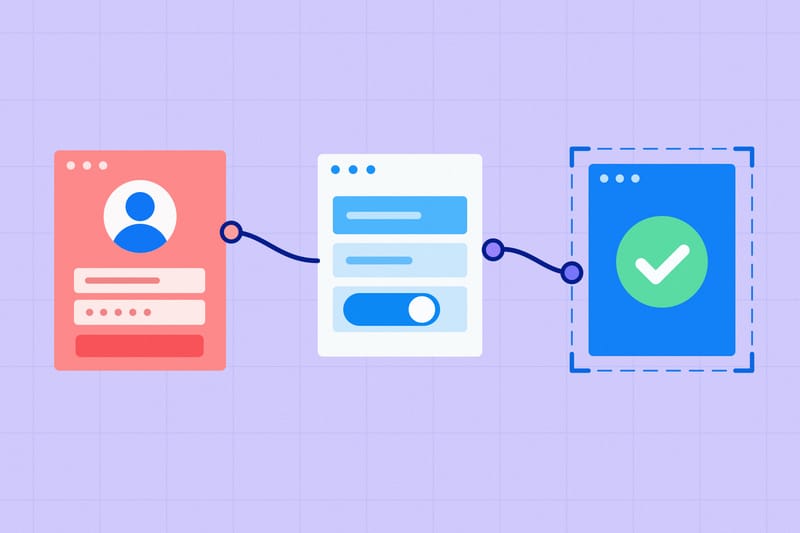
We pick the specific journey to fix, such as onboarding, a dashboard view, or a settings area, and agree every screen and role it touches before starting.
Every state accounted for
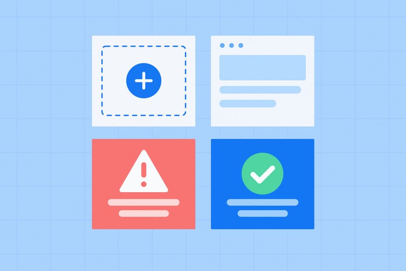
Empty views, loading skeletons, validation errors, confirmations and narrow screens are designed alongside the happy path instead of left to guesswork.
Figma, React, or both
Hire me for the Figma redesign, bring your own Figma files for React implementation, or have me design and build the workflow in one pass.

Built on what you already use
I reuse the components, tokens and library your product already has, and only introduce new pieces where the workflow genuinely needs them.
Responsive and accessible
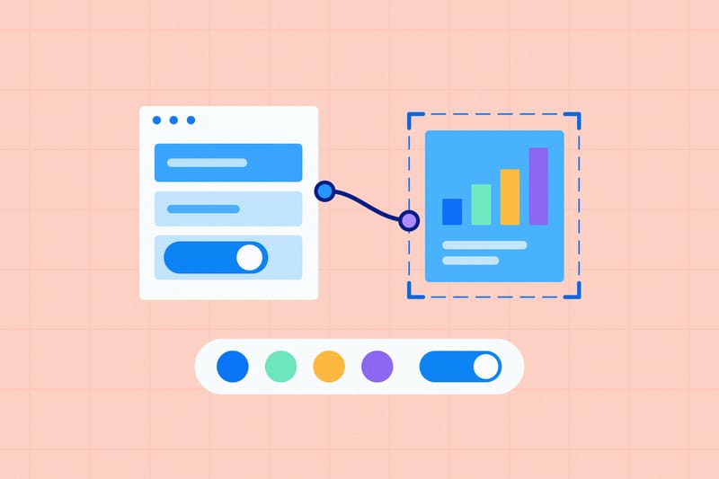
React deliverables are tested for keyboard navigation, focus order, contrast and responsive layout at the screen sizes we agree in the quote.
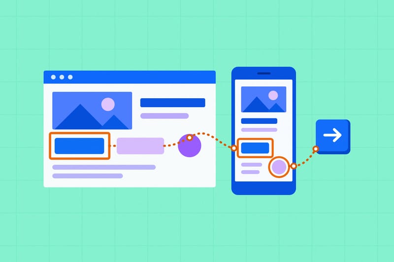
Yours to keep, with 14 days of fixes
You get a clean Figma file or a documented pull request in your repository, plus 14 days of bug fixes on the work I delivered.
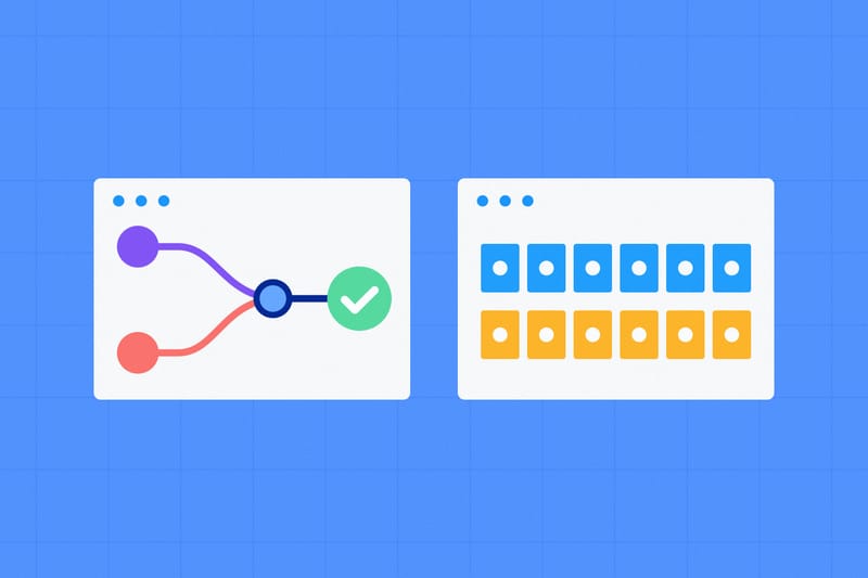
You don’t need to commission a full Design System to fix one part of your app. Every sprint starts with a free review of the target workflow, and the written quote names the routes, states, screen sizes and deliverable format before you commit.
Why start with one workflow.
When a product grows fast, the rough edges rarely spread evenly. Sign-up might be fine while the main workspace feels crowded, or the core feature works well until someone tries to filter a table, invite a teammate or recover from a failed form submission. Fixing the one journey people use every day gives you a visible improvement in a week or two, without pausing the rest of your roadmap.
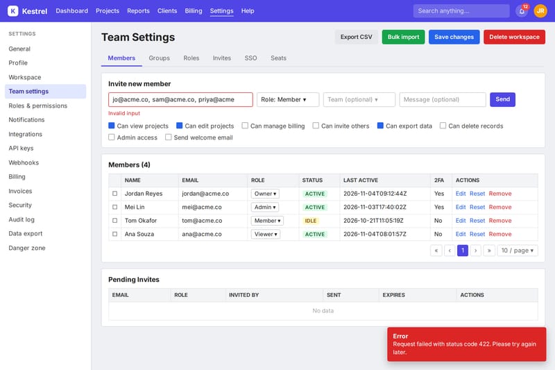
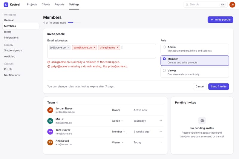
The hardest part of most UI work isn’t drawing the default screen. It’s the decisions around it, like what happens when a new account has no data yet, which fields actually need to be on step one, how an inline error behaves when a request fails, and what stacks or collapses on a smaller laptop screen. Leaving those questions until implementation means engineers have to invent them under a deadline.
That gap shows up even faster in apps built or extended with AI tools like Cursor, Lovable or v0. A prompt can generate a working screen in minutes, but three prompts often produce three different ways to filter a list, save a form or show an error. A sprint pulls that workflow onto one clear pattern in your existing React codebase, without pretending you need a backend rewrite.
And when the same person designs the flow and writes the React components, nothing gets lost in a handoff doc. If your engineers prefer to build it themselves, I hand over structured Figma screens with every state spelled out. If you already have approved Figma files and need them in code, I can start straight from there.
What are we improving?
A sprint works best when we can point to one part of the product and say what feels slow, confusing or unfinished. Pick your workflow and how you’d like it delivered to see what’s involved.
For code delivery, the stack is React with TypeScript, and usually Tailwind CSS and shadcn/ui, Radix or Base UI. If your product uses another component library or custom CSS, I work with what’s there. I can build against your live API or a mocked data layer we agree upfront. Authentication, database changes, backend endpoints and brand identity creation stay outside the sprint, or are scoped separately if you need them.
Workflows I’ve designed and built.
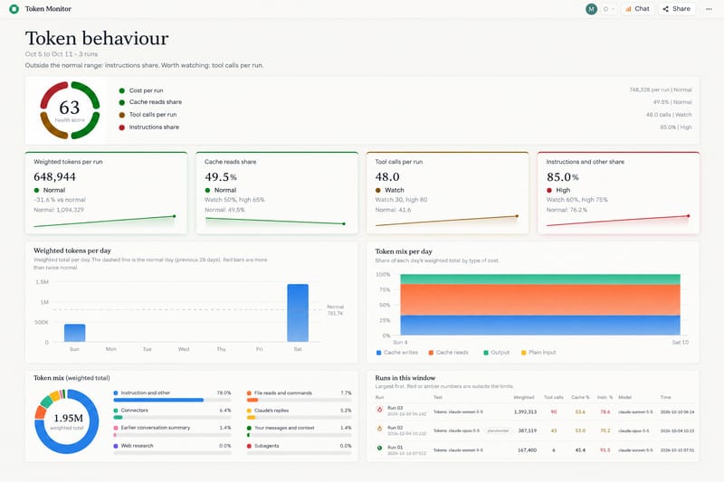
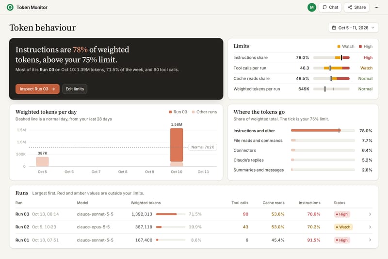
For My Next Filing, a browser-only tax planner for Indian freelancers that made the top 10 out of 13,694 entries in Build What Moves India, the whole product came down to two workflows. One is a questionnaire that adapts to how you earn, and the other is a plan view that tells you the single next action to take.
Every new income type made the form longer, so half the design work went into cutting questions back down. Fields appear only when earlier answers make them relevant, plain-language help text sits where tax jargon would stop someone cold, and users can’t mark a tax payment complete while the balance is still owed.
WeKeep, the accounting platform I’m building now, uses the same approach across invoicing, bookkeeping and admin workflows, with clear hierarchy on data-heavy screens, keyboard-friendly forms and shared React components that behave the same way in light and dark mode.
Before WeKeep, I ran Drool, a design studio for early-stage startups. For SellScale, we redesigned the campaign builder, analytics dashboards and onboarding across more than 200 screens so sales teams could set up multi-step outreach without getting lost.
For MyDrip, an AI shopping app, we mapped and designed the onboarding and preference-capture flow so users could upload photos and get outfit recommendations without a heavy setup wall.

My Next Filing - A Tax Plan for Freelancers in India
A browser-only tax planner for solo freelancers in India. Answer a few questions and get your next action, its due date, and what you still owe.
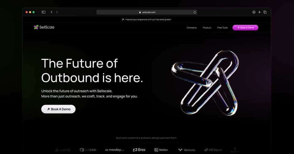
SellScale - AI-Powered Cold Outreach Platform
A comprehensive design overhaul of an all-in-one cold outreach platform that automates LinkedIn and email campaigns for B2B sales teams.
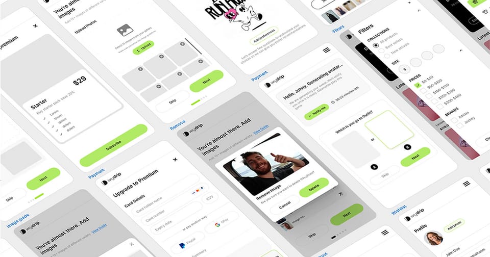
My Drip - AI-Powered Personalized Shopping Experience
An innovative MVP that combines generative AI with personalized eCommerce, delivering daily outfit recommendations with realistic photos of users wearing them.
Priced by workflow, quoted after a review.
A settings page and a multi-role onboarding journey aren’t the same job, so I quote a fixed price after reviewing your workflow. Every quote names the screens, states, responsive breakpoints and deliverable format included. These examples show where most sprints land.
Workflow design
One workflow redesigned in Figma, or built in React from your approved Figma.
From $500
About 1 week
- Review of the target workflow and its friction points
- Revised layout and interaction flow for the agreed screens
- Empty, loading, error and confirmation states
- Desktop and mobile breakpoints where the workflow needs them
- Structured Figma handoff or a React PR from your existing designs
Design and React build
One workflow redesigned in Figma and implemented in your React app.
From $1,000
1–2 weeks
Everything in Workflow design, plus:
- React components and routes built on your existing UI stack
- Connected to your live API or an agreed mocked data layer
- Keyboard, focus and WCAG 2.2 AA contrast checks on the changed screens
- Delivered as a documented pull request with 14 days of bug fixes
Multi-flow overhaul
Several connected workflows redesigned and built in React.
From $2,500
2–4 weeks
Everything in Design and React build, plus:
- Multiple connected flows, such as onboarding through to the main dashboard
- Shared components extracted so the flows stay consistent
- Milestone reviews as each workflow lands
For a $500 sprint, payment is upfront before work starts. On larger quotes, you pay a non-refundable deposit of 25% of the quote or $500, whichever is more, and the balance at handoff or across agreed milestones. On a $2,500 quote, the deposit is $625. Once you accept the quote, the price stays fixed for the agreed scope.
When one workflow turns into more.
Starting with one workflow keeps the commitment small. If you later want to go further, overlapping work is never charged twice.
Additional workflows can be booked one at a time or in batches once the first sprint ships.
A full Design System makes sense when the same buttons, forms and tables are drifting across several parts of the product or across multiple apps. Any components and tokens we establish in a sprint carry straight into the system.
Ongoing frontend work is available on a monthly retainer if you want me to keep designing and shipping new product flows with your team.
From review to handoff.
You work with me directly at every step. Most single-workflow sprints take one to two weeks from deposit to handoff, and nothing gets built in code until you’ve approved the direction.
The review starts with a short call or a recorded walkthrough of the workflow you want to improve. For a live product, a demo account or staging link with sample data helps me test the current states before quoting. Within two working days, you get a written scope naming the screens, states, deliverables and fixed price. The review and quote are free.
Before we start.
These are the questions people usually ask first. If yours isn’t here, ask me directly.
Yes. You can book a Figma-only sprint starting at $500, bring your own approved Figma screens for me to build in React, or combine both starting at $1,000. The quote specifies which deliverables are included.
No. A sprint works with the components, styling and library your product already has. If we find repeated patterns that would benefit from a shared component library later, we can scope a Design System separately without paying twice for components already built.
Yes, for the interface and React frontend. AI tools are great at getting a first version on screen, and less great at keeping layouts, states and components consistent across a whole flow. I redesign and refactor the frontend workflow so it feels coherent. Backend architecture, authentication and security audits are outside this service.
If your API endpoints are ready, I wire the React components straight to them. If the backend is still being built or sits behind private infrastructure you’d rather not expose, I build against a typed mock data layer so your engineers can swap in the real queries cleanly. We agree which approach to use before work starts.
That’s fine. While React with Tailwind CSS and shadcn/ui is my default, I also work with Chakra UI, MUI, Radix, Base UI or custom CSS. I check your repository setup during the review so the code I hand over matches the rest of your app.
A link to your product or Figma file, a short description of what feels off in the workflow, and either a short call, a recorded Loom walkthrough or a demo login with sample data. I’m happy to sign an NDA first. Please don’t send passwords through the form, as we arrange access after you reach out.
For 14 days after handoff, I fix any bugs in the React code or discrepancies in the Figma specs I delivered at no extra cost. New features, extra workflows or backend changes after handoff are quoted separately.
You do. Once the sprint is paid for, the Figma files, components and code I deliver belong to you in your own workspace and repository.
Let’s look at your workflow.
Tell me which workflow needs attention and whether you want Figma designs, React code, or both. I’ll get back to you within two working days. The review and quote are free, and submitting this form doesn’t commit you to anything.